Hints for a sucessful print job This digital guide will show you how
to set up your files to go to press,
as well as hints and tips
for good print design
|
During slow times at Nomad, I put together this helpful website, to help our customers get there files ready for print.
Unfortunately, there were fewer and fewer slow days, I'm still proud of it, so take a look! |
 Introduction
|
Each section is designed to explain an important concept in electronic printing.
This Section introduces general printing concepts and color models, plus some information on file formats.
Section Two explores Adobe® PhotoShop and bitmap art, plus some helpful hints.
Section Three explores Adobe® Illustrator and vector art, besier curves, and some hints how to use fonts in your print job.
Section Four covers how to use page layout applications for your print job, focusing on Quark® Xpress.
Quark, Illustrator, and PhotoShop are the workhorses of modern printing.
Even if you don't use these particular applications,
the concepts introduced are applicable to any print job.
In the 1800s, printing developed rapidly into science, advances in photography made mass production of print easier, faster, and cheaper. The flat printing plate was replaced by cylindrical rollers, making easier to ink paper consistently, and presses could run even faster. Plates and presses began to be made with iron, increasing their speed and durability as well.
Today, printing is driven by the precision and power of computers, plates are made of plastic or metallic alloys, and the modern science of printing is more versatile and convenient yet.
click here to return to the table of contents
 Color Models for Print and Screen
|
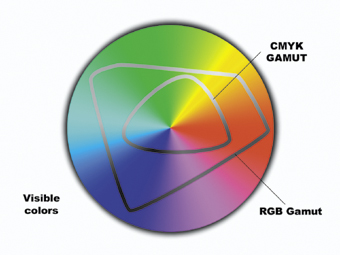 Most industrial printing is done with four inks; Cyan, Magenta, Yellow, and Black. These are the primary colors for ink.
The range of colors that a color system can represent is called a gamut.
The images on your computer screen are created by Red, Green, and Blue light, the primary colors of light. Red Green and Blue Light can create far more colors than the 4 process inks. So, The RGB gamut is bigger than the CMYK gamut.
|
This is our first hurdle for good print files. Be sure the files you submit are in CMYK color mode. |
click here to return to the table of contents
|
The CYAN plate is rolled onto the paper like this,
|
and the MAGENTA is put down right after like this
|
|
|
and again with YELLOW,
|
and lastly, BLACK is put in to add depth and detail,
|
|
|
for a final printined image like this.
|
||
Commercial printing is usually produced at 133 or 150 lines of color dots per inch. This is referred to as a line screen. The angle at which the ink is laid down is called a screen angle.
To get a good quality image to print at 150 lpi (lines per inch), your images need to have 300 dpi (dots of color per inch). Your computer monitor only needs about 75 dots per inch to display a image and look good.
This measure of an image's detail is called resolution.
Your color bitmap images should have a resolution 300 dpi (dots per inch). This is enough detail to print images like photographs, patterned backgrounds, and paintings.
Text is created with mathematical curves, and solid lines. Since text is usually solid black, it doesn't need to be screened, ink is laid down as solid shapes instead of little dots of inks. This allows vector art to be output at the maximum resolution of the press. This is an incredible 2,780 dots per inch! You can't see that level of detail without a magnifying glass.
To get logos and flat areas of color as sharp as you would notice with the naked eye, these elements need to be created at 1,200 dpi.
|
This is our second hazard to good printing.
Make sure your bitmap images are at least 266 dot per inch |
click here to return to the table of contents
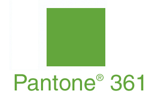
Pantone® makes a Green ink that will consistently be that Pantone® Green.
Due to the limits of the process, We cannot guarantee spot colors will register with CMYK colors. Basically, If Nomad prints CMYK, we have to run the printed piece back through the press and print spot colors on this second run. So, Spot colors are next to impossible to keep aligned with the first pass. To register spot color with CMYK, your costs will be greater due to the extra work involved.

More information on raster art (grids of dots of color) and vector (mathematical lines and curves) is available in the PhotoShop and Illustrator sections.
click here to return to the table of contents
|
|
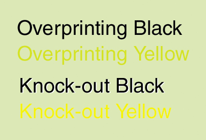
Black and yellow inks, overprinting and knocking out. Notice how the black that is set to knock-out will create a white fringe if it does not register perfectly. Also, Note how Yellow ink mixes with the background when overprinting, changing the appearance drastically. |
Nomad's formula for Rich Black is 50% Cyan, 40% Magenta, 30% Yellow, and 100% Black inks.
click here to return to the table of contents
 Digital File formats and information
|
Text, and vector art (created in applications like Illustrator) is described differently than bitmap images. Vector art and text are understood by the computer as shapes based on mathematical calculations of lines and curve-control points on these lines.
Since Illustrator uses vector calculations instead of raster information, it can be resized easily without losing any detail.
click here to return to the table of contents